Watch-First Design
How do you design an iOS app? By starting with the watch.
Do you remember WAP sites from the days before the fully-functional mobile web?

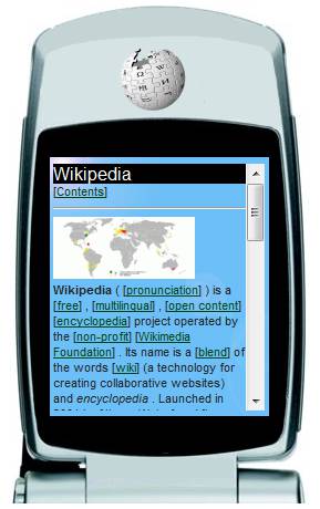
A WAP site
I liked using the WAP version of sites (if available) even after I got an iPhone. They were clean, they loaded quickly, and they had the important core parts of the site front and center.
Planning out your next iOS app? Even if a WatchKit extension isn’t part of those plans, think about it — what is the essence of your app, distilled down to a single watch-sized interface?
Designing with constraints in this way can really help you get an idea of what’s really important.
Designing with constraints
When the responsive design era of the web came about, the new idea was to start with mobile first. Think about the core of your site and design for small screens first, then expand out to bigger screens.

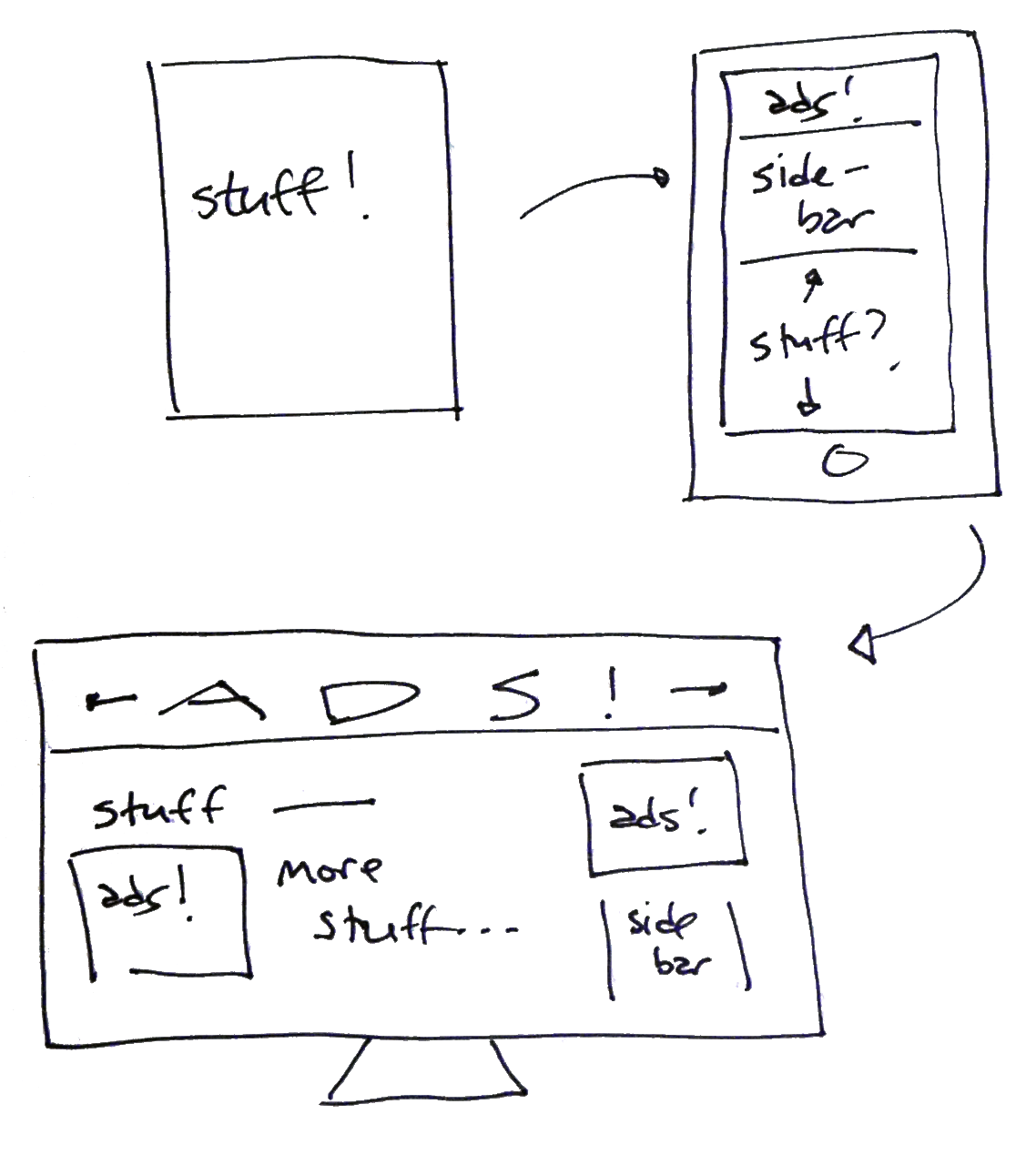
WAP to phone to desktop
That’s a pretty good tip if you’re feeling stuck: give yourself a constraint to work with to get yourself thinking differently. Stuck on design? Sketch out your site so it only uses three colors. Writer’s block? Try writing a few paragraphs with no adverbs. Write a few paragraphs with an adverb in every sentence.
In the case of the web, you need to strip away the fringes to get to the inner kernel. What is this web site really about? If someone coming to the site only took one glance and never scrolled, what would you want them to see? There isn’t too much room above the fold on mobile; what’s really important to your users?
Watch-first design
This is a good exercise to do when thinking about your iOS apps: determine what is the essence of your app, distilled down to a single watch-sized interface. Even if you’re not planning on building a companion watch app, think about it and see where it leads you.

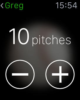
Screen from Pitch X
What is the information your users will want to know about? What are the actions they will want to have closest at hand?
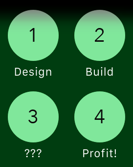
The watch context menu can have up to four buttons. If each button presents a modal, imagine your app could only have four other screens. What would you put in those additional screens? Could you make do with fewer than four?

Button-mashers will wear out the lower-right corner…
Now that you’ve designed with constraints and figured out what’s really important, expand out to the phone, tablet, and wherever else. Again, even if you never build the watch part, think of how much you’ve learned about the app!